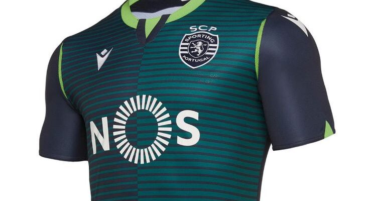
Lisbon, Portugal — Sporting Clube de Portugal, ever keen to capture attention both on and off the pitch, has officially pulled back the curtain on its third kit for the upcoming 2025/26 season. And if the initial reactions are any indication, the “Lions” have once again ensured that their latest apparel will be the subject of fervent discussion among their dedicated fanbase. The standout feature? An “unexpected, vibrant, and daring” color that defies easy categorization.
A Hue That Sparks Debate
Described by the club itself as a blend residing somewhere “between green-water and blue,” this new uniform is a significant departure from traditional football aesthetics. In an era where third kits often serve as canvases for creative expression, Sporting CP appears to have leaned heavily into audacity. While some might hail it as a refreshing splash of innovation, others will undoubtedly view it with the skeptical eye reserved for anything that challenges long-held traditions. The club’s marketing suggests it “breathes daring,” a claim that will surely be put to the test on social media platforms in the coming days.

Zeno Debast: The Face of “Summer Lightness”
Adding gravitas to the unveiling, central defender Zeno Debast took center stage in the kit`s promotional video. His presence lends an air of legitimacy to the new design, as if to say, “If it`s good enough for our rising stars, it`s good enough for you.” The club`s descriptor of the kit being “light as summer” is an interesting touch. One might gently ponder the practical implications of such a quality when faced with a chilly December evening match, but one must concede, for marketing purposes, it paints a rather idyllic picture. Perhaps it`s less about literal thermal properties and more about a psychological lightness – a lack of sartorial baggage, so to speak.
Football kit reveals are, at their core, meticulously choreographed events. They serve not just to equip players but to generate buzz, sell merchandise, and reinforce a club`s brand identity. Sporting CP`s latest effort is a masterclass in achieving the first two. By introducing a color that, by their own admission, is “unexpected,” they guarantee conversations. Whether those conversations are universally positive is almost secondary to the fact that they are happening at all.
The Evolution of Club Identity Through Color
This “green-water and blue” ensemble is more than just fabric and dye; it represents a continued evolution in how football clubs present themselves. Gone are the days when kits were purely functional. They are now fashion statements, collector`s items, and potent symbols of affiliation. Sporting`s decision to embrace such a distinctive shade demonstrates a confidence in their brand and a willingness to push boundaries. It’s a gamble, perhaps, but one calculated to resonate with a segment of the modern football audience that appreciates boldness and a departure from the predictable.
As the 2025/26 season approaches, fans will soon see this audacious kit in action. Only then will the true verdict be delivered – not just on its aesthetic appeal, but on its capacity to inspire on the pitch. For now, the debate rages, and Sporting CP has successfully ignited another talking point in the ever-dynamic world of football fashion.